
Stop Building Your UI Components like this❌
It is true everyone feels elated abstracting the most often copy-pasted code in the codebase into a reusable component. One bad effect of that is hasty abstractions which is a story for another day, today's agenda is to learn how to make actually reusable components.
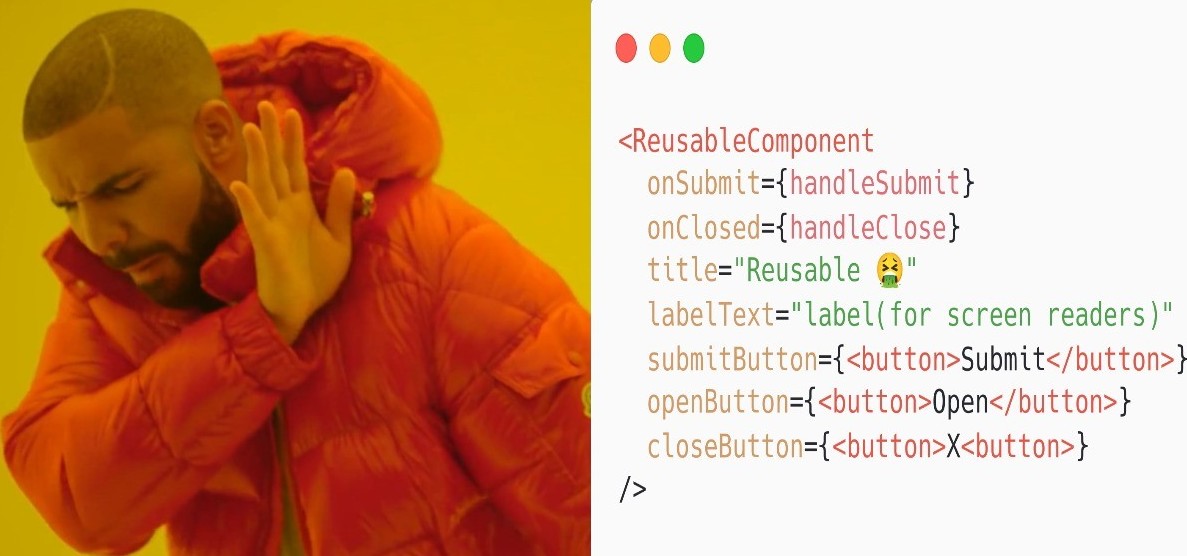
Lots of the time while abstracting the reusable component it turns into a mess of props. You've probably seen "reusable" components with over 50 props! Those end up being enormously difficult to use and maintain, at the same time it brings performance problems and actual bugs that are hard to track.
Adding one prop for a new use-case is not just an if statement and you end up making a lot of changes in the component making the code size huge and unmaintainable.
But if we're mindful of the kinds of abstractions we create, then we can make something truly easy to use and maintain, is bug-free, and not so big that users pay the download penalty.
Kent C dodd's has explained the problem in-depth, give it a watch: Simply React
How does a reusable component look like?
We've got a `LoginFormModal` component that's abstracted the modal for the login and registration forms. The component itself isn't all that complicated and only accepts a handful of props, but it's pretty inflexible and we'll need to create more modals throughout the application so we want something that's a lot more flexible.
1<LoginFormModal
2  onSubmit={handleSubmit}
3  modalTitle="Modal title"
4  modalLabelText="Modal label (for screen readers)"
5  submitButton={<button>Submit form</button>}
6  openButton={<button>Open Modal</button>}
7/>
Towards the end, we will create our component which can be used like this:
1<Modal>
2  <ModalOpenButton>
3    <button>Open Modal</button>
4  </ModalOpenButton>
5  <ModalContents aria-label="Modal label (for screen readers)">
6    <ModalDismissButton>
7      <button>Close Modal</button>
8    </ModalDismissButton>
9    <h3>Modal title</h3>
10    <div>Some great contents of the modal</div>
11  </ModalContents>
12</Modal>
But isn't this more code and more complex than just passing the prop😒.
We have passed the responsibility to the user of the component rather than the creator, this is called inversion of control. It's definitely more code to use than our existing `LoginFormModal`, but it is simpler and more flexible and will suit our future use cases without getting any more complex.
For example, consider a situation where we don't want to only render a form but want to render whatever we like. Our `Modal` supports this, but the
`LoginFormModal` would need to accept a new prop. Or what if we want the close button to appear below the contents? We'd need a special prop called `renderCloseBelow`. But with our `Modal`, it's obvious. You just move the `ModalCloseButton` component to where you want it to go.
Much more flexible, and less API surface area.
This pattern is called Compound Component - components that work together to form a complete UI. The classic example of this is `<select>` and `<option>` in HTML.
It is widely used in many real-world libraries like:
- Reach UI
- MUI
Let's create our first Compound Component while building a reusable `modal`.
Building our first compound component
1import * as React from 'react'
2import VisuallyHidden from '@reach/visually-hidden'
3
4
5/* Here the Dialog and CircleButton is a custom component
6Dialog is nothing button some styles applied on reach-dialog
7component provided by @reach-ui */
8import {Dialog, CircleButton} from './lib'
9
10
11const ModalContext = React.createContext()
12//this helps in identifying the context while visualizing the component tree
13ModalContext.displayName = 'ModalContext'
14
15
16function Modal(props) {
17  const [isOpen, setIsOpen] = React.useState(false)
18
19
20  return <ModalContext.Provider value={[isOpen, setIsOpen]} {...props} />
21}
22
23
24function ModalDismissButton({children: child}) {
25  const [, setIsOpen] = React.useContext(ModalContext)
26  return React.cloneElement(child, {
27    onClick: () => setIsOpen(false),
28  })
29}
30
31
32function ModalOpenButton({children: child}) {
33  const [, setIsOpen] = React.useContext(ModalContext)
34  return React.cloneElement(child, {
35    onClick: () => setIsOpen(true),
36})
37}
38
39
40function ModalContentsBase(props) {
41  const [isOpen, setIsOpen] = React.useContext(ModalContext)
42  return (
43    <Dialog isOpen={isOpen} onDismiss={() => setIsOpen(false)} {...props} />
44  )
45}
46
47
48function ModalContents({title, children, ...props}) {
49  return (
50    //we are making generic reusable component thus we allowed user custom styles
51   //or any prop they want to override
52    <ModalContentsBase {...props}>
53      <div>
54        <ModalDismissButton>
55          <CircleButton>
56            <VisuallyHidden>Close</VisuallyHidden>
57            <span aria-hidden>×</span>
58          </CircleButton>
59        </ModalDismissButton>
60      </div>
61      <h3>{title}</h3>
62      {children}
63    </ModalContentsBase>
64  )
65}
66
67
68export {Modal, ModalDismissButton, ModalOpenButton, ModalContents}
Yay! We did quite some work, we can now use the above component like:
1<Modal>
2     <ModalOpenButton>
3         <Button>Login</Button>
4     </ModalOpenButton>
5     <ModalContents aria-label="Login form" title="Login">
6         <LoginForm
7            onSubmit={register}
8            submitButton={<Button>Login</Button>}
9          />
10      </ModalContents>
11 </Modal>
The code is more readable and flexible now.

Bonus: Allowing users to pass their own onClickHandler
The `ModalOpenButton` and `ModalCloseButton` set the `onClick` of their child button so that we can open and close the modal. But what if the users of those components want to do something when the user clicks the button (in addition to opening/closing the modal) (for example, triggering analytics).
we want to create a callAll method which runs all the methods passed to it like this:
1callAll(() => setIsOpen(false), ()=>console.log("I ran"))I learned this from Kent's Epic React workshop. This is so clever, I love it.
1const callAll = (...fns) => (...args) => fns.forEach(fn => fn && fn(...args))Let's use this in our components:
1function ModalDismissButton({children: child}) {
2  const [, setIsOpen] = React.useContext(ModalContext)
3  return React.cloneElement(child, {
4    onClick: callAll(() => setIsOpen(false), child.props.onClick),
5  })
6}
7
8
9function ModalOpenButton({children: child}) {
10  const [, setIsOpen] = React.useContext(ModalContext)
11  return React.cloneElement(child, {
12    onClick: callAll(() => setIsOpen(true), child.props.onClick),
13  })
14}
The power can be used by passing an `onClickHandler` to our custom button like this:
1<ModalOpenButton>
2  <button onClick={() => console.log('sending data to facebook ;)')}>Open Modal</button>
3</ModalOpenButton>
Conclusion
Don't make hasty abstractions and don't leave everything to props. Maybe it is a simple component now but you don't know what use-cases you would need to cover in future, don't think of this as the trade-off between time and maintainability, the complexity can grow exponentially.
Leverage the power of composition in React with compound components and make your life easier.
A little about me I am Harsh and I love to code. I have been doing this since 16. I feel at home while building web apps with React. I am currently learning Remix.
If you liked the blog, Let's Connect! I am planning to bring more such blogs in the future.
Check my Testing hooks blog or how to build generic custom hook blog.

Harsh
Loves to Code 👨💻 | React Junkie ⚛️ | Learning and sharing 📚
Leave a Reply
Related Posts
No posts right now.